Here’s how you take contest-winning photographs
We ran a summer-themed photography contest in August, where contestants had to share what summer meant to them through an image. The only condition was the photo had to be clicked on a Fairphone. With hundreds of entries coming in and oodles of camera skills on display from our Fairphone community, it wasn’t easy choosing the winning snap. We asked our in-house photography expert, Jan Kohler, to give his take on why certain photographs spoke to him more than others. Here’s what he had to say.
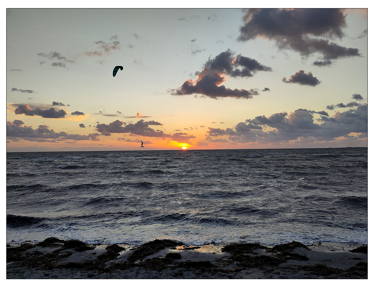
«This photograph makes great use of some classic composition techniques. Notice the way the sun is centered in the image, aligning the horizon to the middle of the frame. This gives the photo perfect symmetrical balance, while still using the rule of thirds by placing the subject on the left side. It is also a great action shot, highlighting the camera’s quick shutter speed and wide color range. I look at this photograph and I think freedom, fun, open seas. Now that’s very summer.»
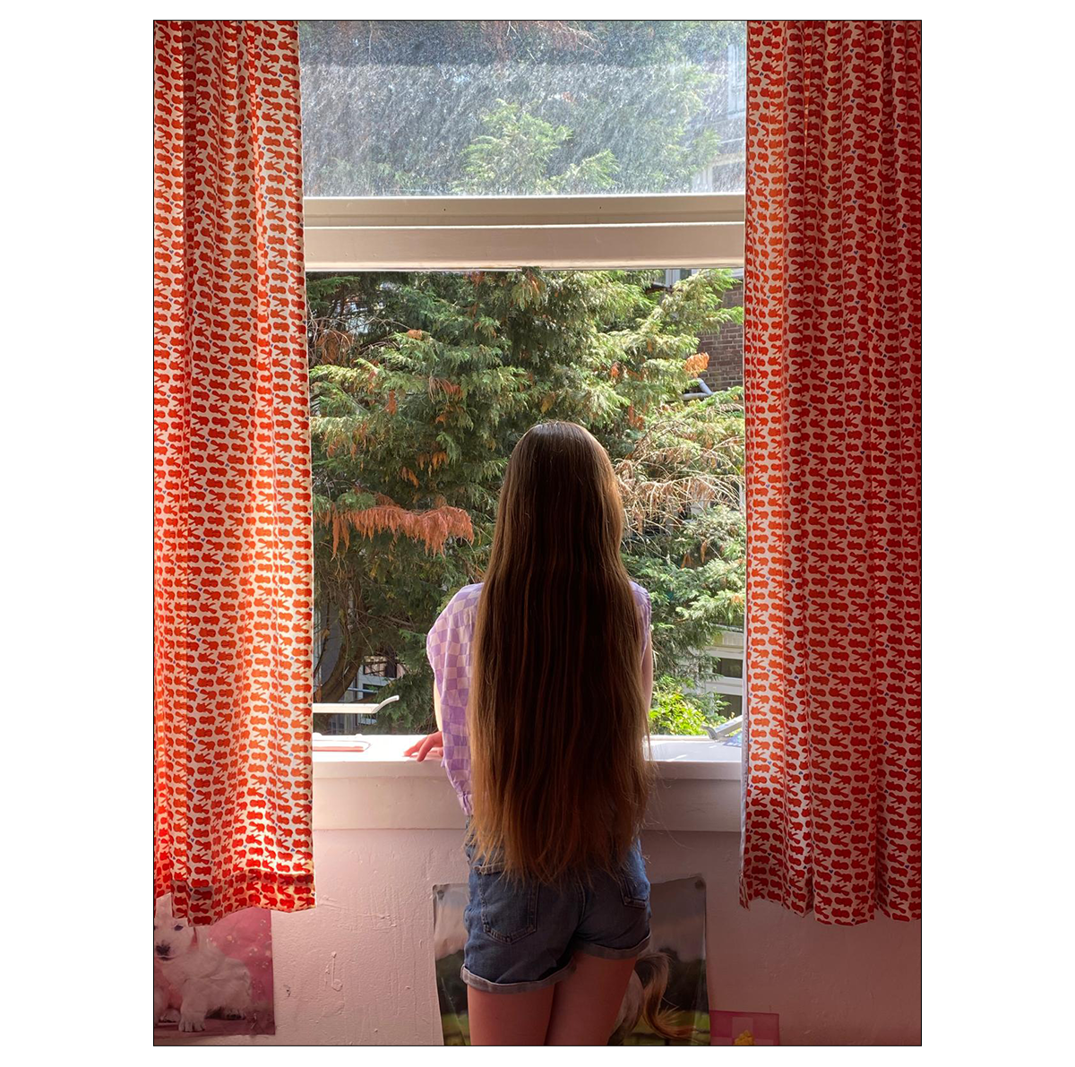
«The symmetry in this photograph is what really stands out. The curtains on both sides framing the subject perfectly gives the image excellent balance, elevating its aesthetic appeal. The image, as a whole, seems to be telling a story without any words. It gives you a sense of wonder that is very difficult to capture.»
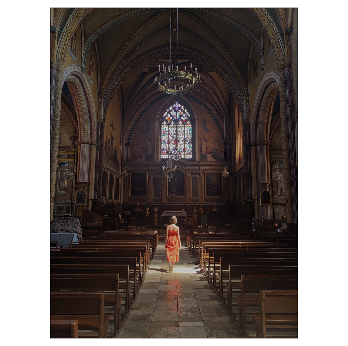
«This image makes wonderful use of light, movement and symmetry. You get to see the many details of the church, while still focusing on the subject in the middle, highlighted by light entering the space. The photographer has also used leading lines with the benches to great effect, drawing the viewer’s eyes towards the subject immediately. The only con I can say about this photograph is that it doesn’t stick to the theme of the contest, but that shouldn’t take away from how excellent the composition is, almost painting-like.»
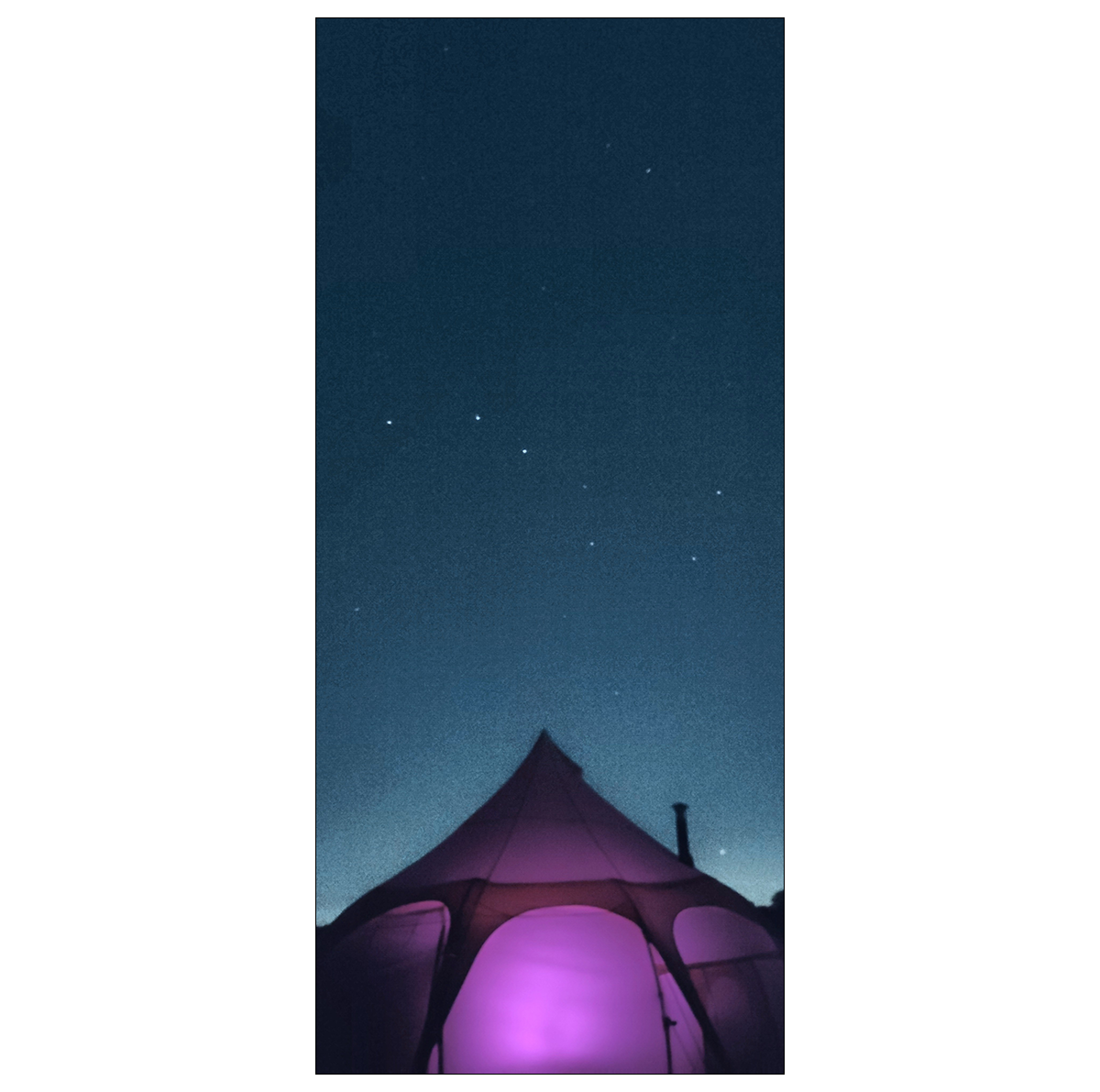
«This photograph made it to our final shortlist for its unconventional composition. The photographer has placed the subject at the base of the image, making the tent act as a symbolic arrow that points to the starry night above. This photo seems to have been clicked on a tripod at an extremely slow shutter speed, possibly with the camera’s night mode switched on. I love the purple glow from the tent as well, giving the photo an almost interstellar vibe.»
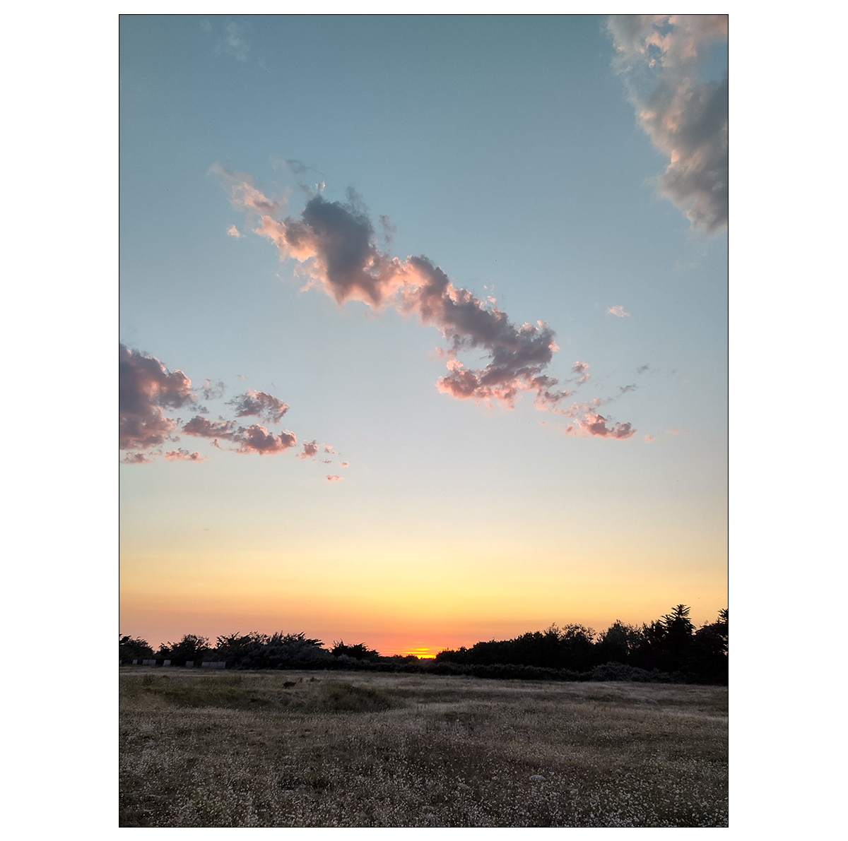
«The range of colors and detail in this photograph really spoke to me. The image is split into three parts. We have the rolling field of green on the bottom third of the image. On top, the blue sky and clouds open up the image, giving a sense of space and freedom. The cherry on top is the horizon and the setting sun cutting through the middle, providing a beautiful contrast. The sunset reflecting on the bits of clouds makes the photograph almost painting-like. Overall, this is a great example of the right framing, light and color balance.»
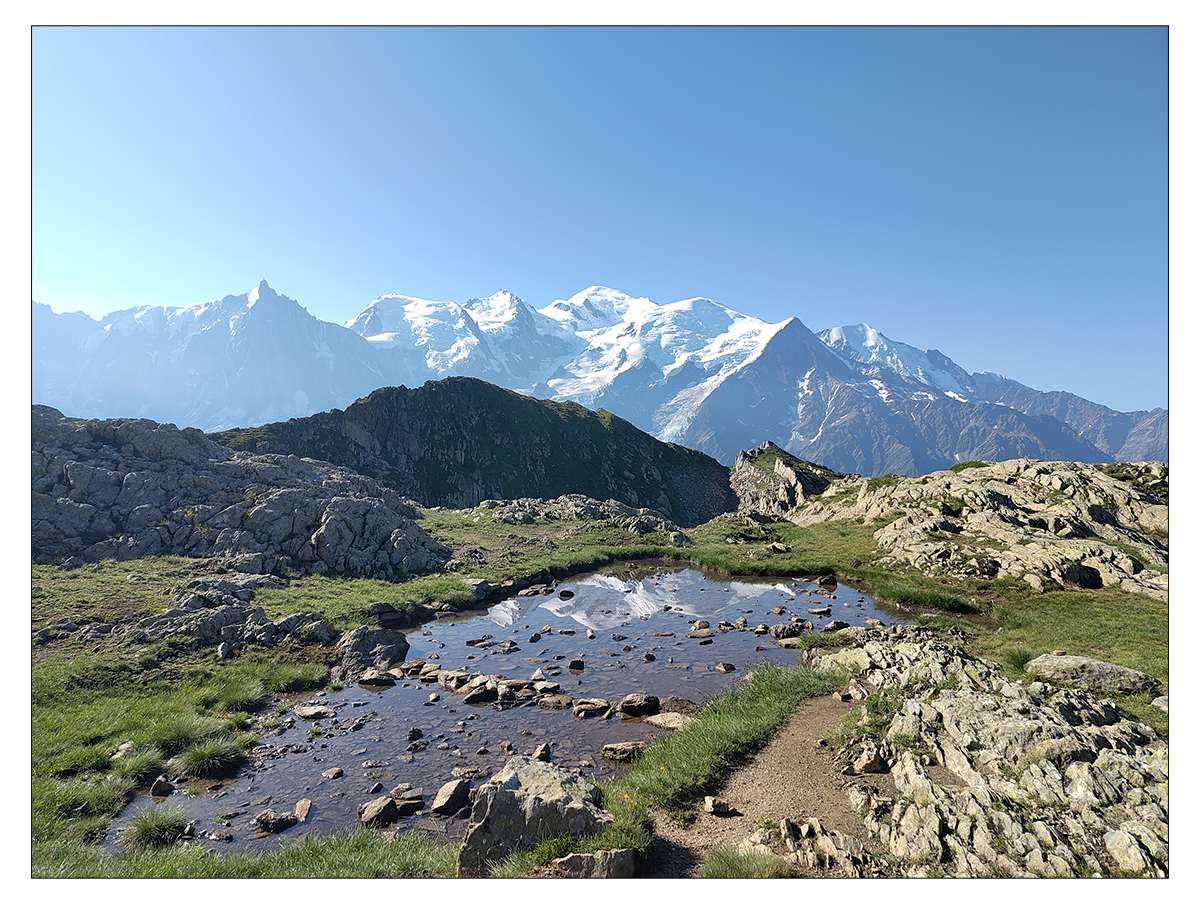
«The depth the photographer captures in this image and the way they have layered it is excellent. The stones and water in the foreground, the shadowy mountain in the midsection, and the snow-capped peaks in the far back– all of it put together gives you a true feeling of the vastness of the space. At the same time, the photographer has left headspace and ground space, with the added bonus of reflecting the mountains in the water. There’s so much going on in this image, and that’s not a bad thing at all.»
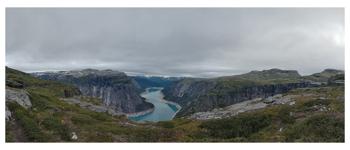
«This photograph is an excellent example of how to use leading lines. The mountains are almost leaning inward, pointing to the river. Meanwhile, the river itself, positioned right in the center of the image, guides the viewer’s eye to follow its bends and curves. Composition-wise, the image can be perfectly split into two halves, which only adds to its aesthetic appeal.»
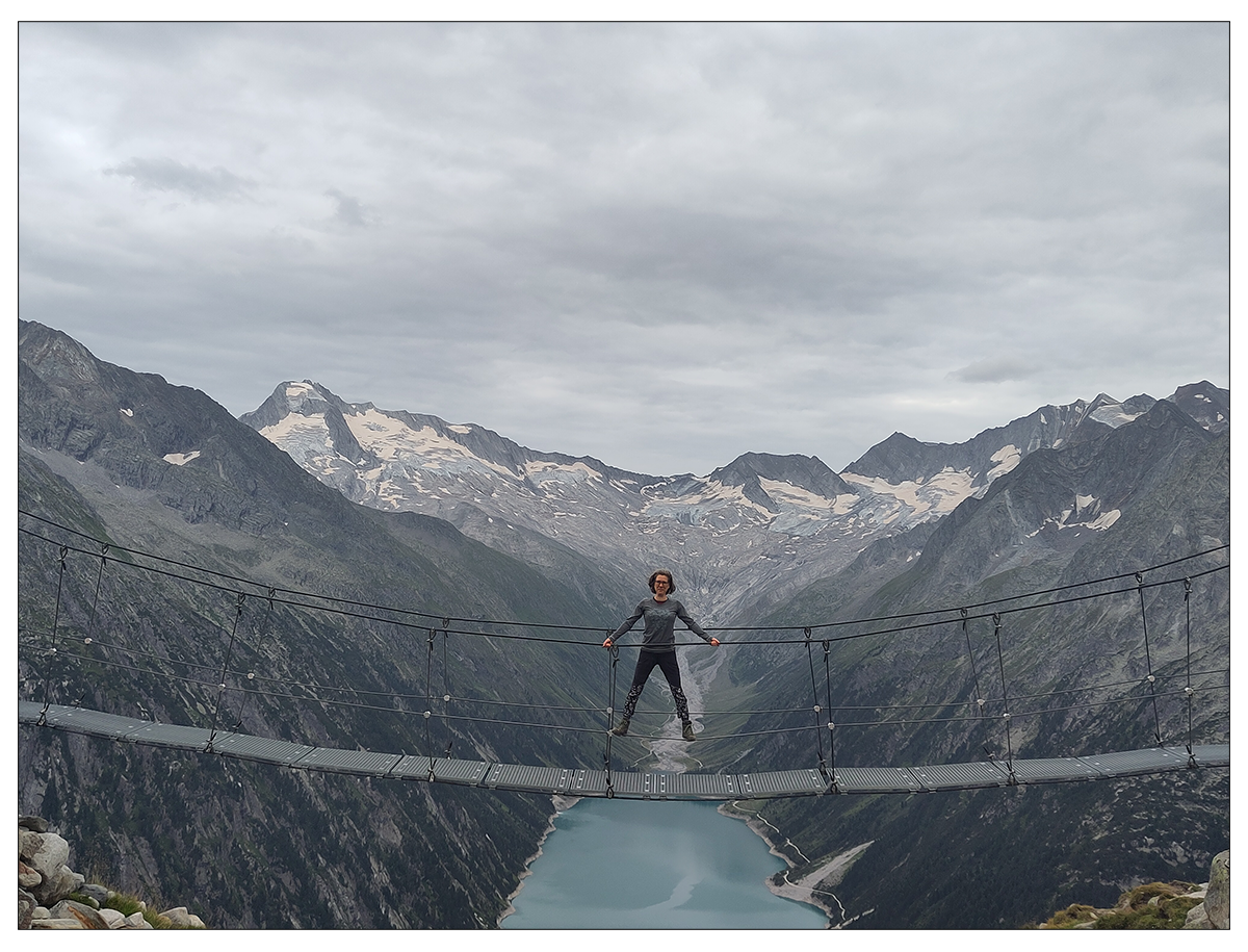
«The great use of framing and leading lines in this photograph is what elevated it to our shortlist. Symmetry-wise, the subject is in the middle of the image, but is still given some space above to showcase the mountains and the sky. The mountains and lake at the bottom all point towards the subject in the middle of the image. No matter where you look, your eyes are naturally drawn to the center of the image. It helps that the subject is wearing similar colors to their surroundings, making for a consistent color palette and helping the entire image mesh together really nicely.»
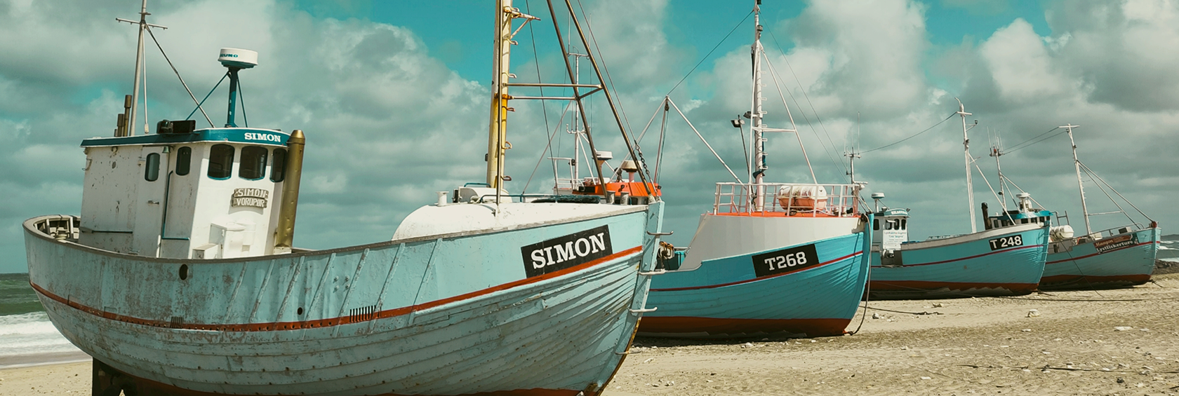
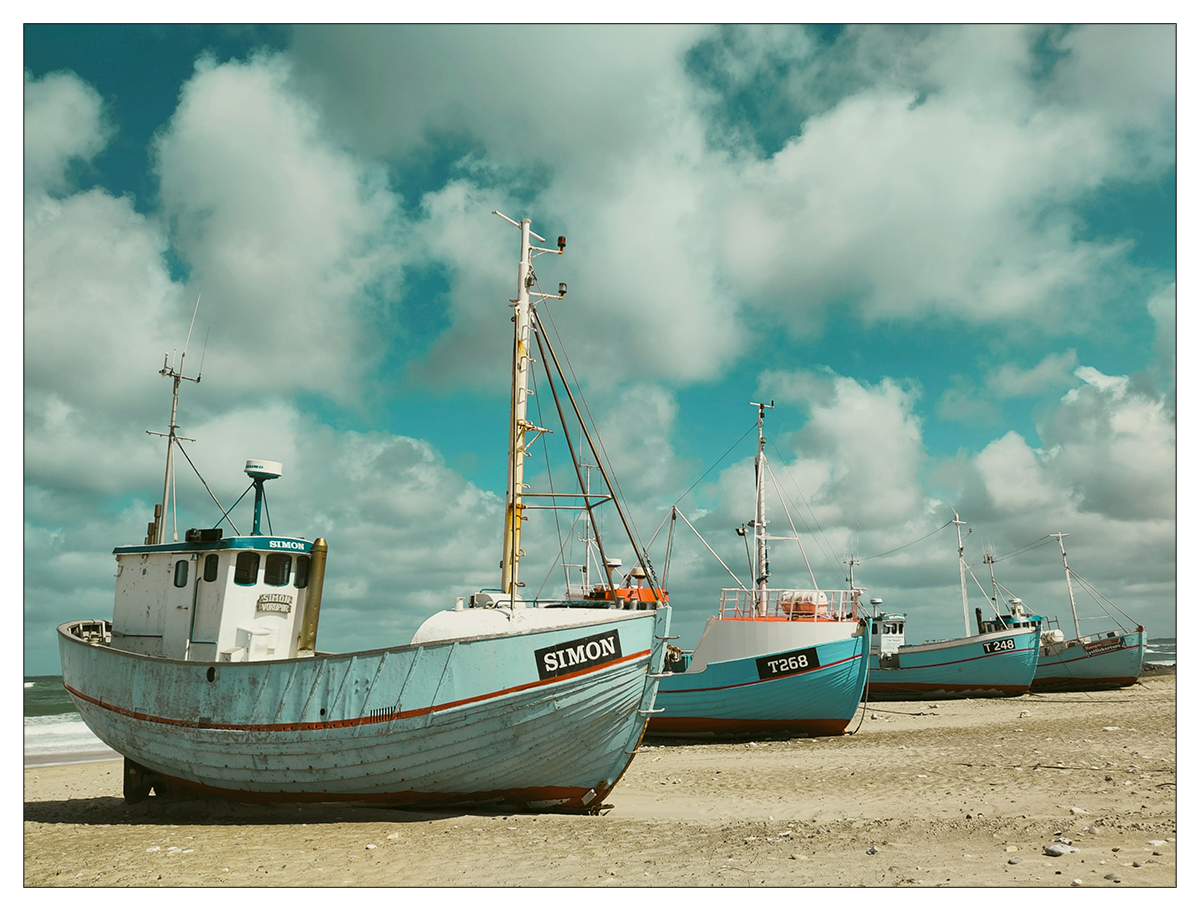
«This shot was one of my personal favorites from the contest entries. Sometimes, it’s nice to give your photos a little personality, and this image is a great example of that. The vintage color grade, the perfectly arranged boats on the shore, it also seems like this was photographed on a film set somewhere. Because of the way it is framed, you can tell that the photographer made good use of positioning and moving themselves around to find the best angle. The way the image is framed also balances the weight of the boats in an even horizontal line, which makes the image even more aesthetically pleasing.»
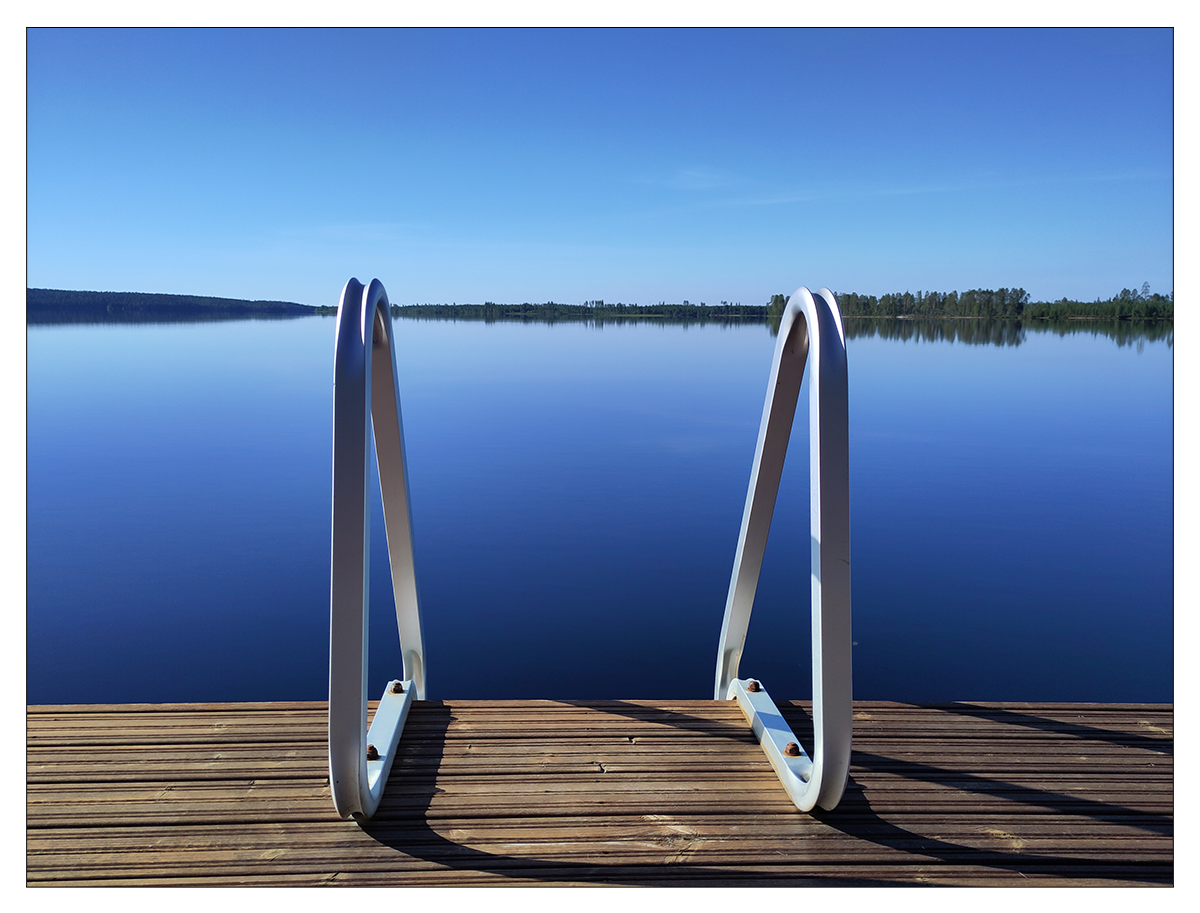
«And this is the one that beat the competition by popular vote to become our winning photograph. The reason why we chose this image as our winner eventually was because it brings together all the techniques we mentioned earlier. There is some playful symmetry going on. There is excellent use of depth with the layering of elements in the foreground and background. The leading lines from the rails have been used to strong effect. The color balance is spot on. But more importantly, there is a very strong story here that ties perfectly to the theme of the contest. The still water, combined with the sun shining on the wooden deck and off the metallic rails, is the perfect visual representation of a summer day by the lake.»
Check out the Fairphone 4 and the Fairphone 5 for yourself on our Shop page.
