8 Tips For Better Photo Composition
It’s not the tool that matters. It’s how you use it.
While the origin of this quote and its author are hard to pin down, the message is one that is becoming more and more relevant with each passing day. It couldn’t be truer when it comes to mobile photography. It’s not enough to have cameras equipped with Hollywood movie magic inside. You still need to know how to get that magic out. That’s why it’s always good to go back to the basics every once in a while. And with photography, the foundation is composition, that is to say, how to compose the perfect picture. Here are eight tips that will help you understand basic composition better and take your photography skills to the next level.
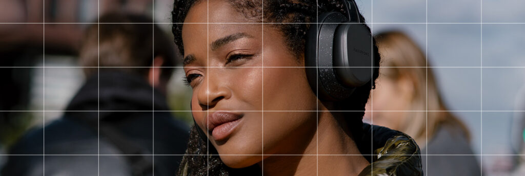
THE RULE OF THIRDS: One of the oldest rules of photo composition (and my personal favorite) is the rule of thirds. Use a 3×3 grid to divide your screen into three parts horizontally and vertically. The screen should be split into nine boxes. By placing what you want to be the main focus of your image on any one of the intersections where the horizontal and vertical lines meet, you will automatically draw the viewer’s attention to it.
LEADING LINES: Leading lines are lines in your surroundings you can use to draw the viewer’s eyes towards your subject. For example, if you place a subject in the middle of a narrow street, and frame the subject so that the streets converge right behind the subject’s face, viewers will automatically focus on your subject. You can use bridges, canals, roads, alleys and even stairwells. Think of it as using the surroundings to point directly at where you want your audience to look.
CENTERING AND SYMMETRY: According to most experts, beauty is often closely interlinked with symmetry. This couldn’t be truer for beautiful photographs. Symmetry is very pleasing to the eye. If you frame things perfectly centered and symmetrical in your image, the end result will have an aesthetic that will be very hard to ignore.
SPACE IT OUT: This depends on what you are going for, but is paramount when photographing a specific subject. As a rule, try to leave some extra space on the top third of the image. This gives the photo a sense of space and makes the image less “claustrophobic”
WHAT’S YOUR POSITION?: With classic portrait photography, try to get at eye level or even slightly below your subject’s eye level. This will make your subject feel taller, and will also not make them look distorted. If you take an image from a high angle, then you can make your subject appear shorter than they actually are. This could be a stylistic choice, of course. At the end of the day, we recommend moving yourself around the subject instead of moving the subject themselves. Where you position yourself influences the result greatly.
DEPTH AND DIMENSION: Include elements in your foreground. This gives your photos depth and makes it really pop. Try to place your subjects between elements which are closer and further away from the camera. This works even better when you are shooting video, making your frame feel fuller and more alive. Otherwise, you run the risk of your frame looking very flat and two-dimensional.
OVERCROWDING IS A NO: Again, this depends on what you’re going for. If you’re shooting a scene at a busy market, a busy image is exactly what will work. But if it’s portrait or product photography, keep it simple. If the image is too busy, then our eyes won’t know where to focus. By getting closer to the subject, or finding a cleaner background, you can help the viewer focus on what you want them to focus on.
PRACTICE MAKES PERFECT: As always, keep shooting stuff and keep experimenting. Don’t be afraid to get out of your comfort zone. That’s the best way to see what works for you and finding a style that fits your aesthetic.
With the recently updated Fairphone 4 and the award-winning Fairphone 5, your mobile photography game is already half-won. Check out our range in the Fairphone webshop.
Share this post
The post you are currently reading is an AMP HTML document; an optimized version for mobile usage to increase loading speed and decrease data usage. To see our full website you can visit our own mobile version of this post.